WhyDonate
Global crowdfunding, made effortless to start.
- Client
- WhyDonate
- Industry
- Technology · Donation crowdfunding
- Category
- Strategy · Brand · Design system · Product
- Partnership
- 2019 — present · ongoing
Mandate
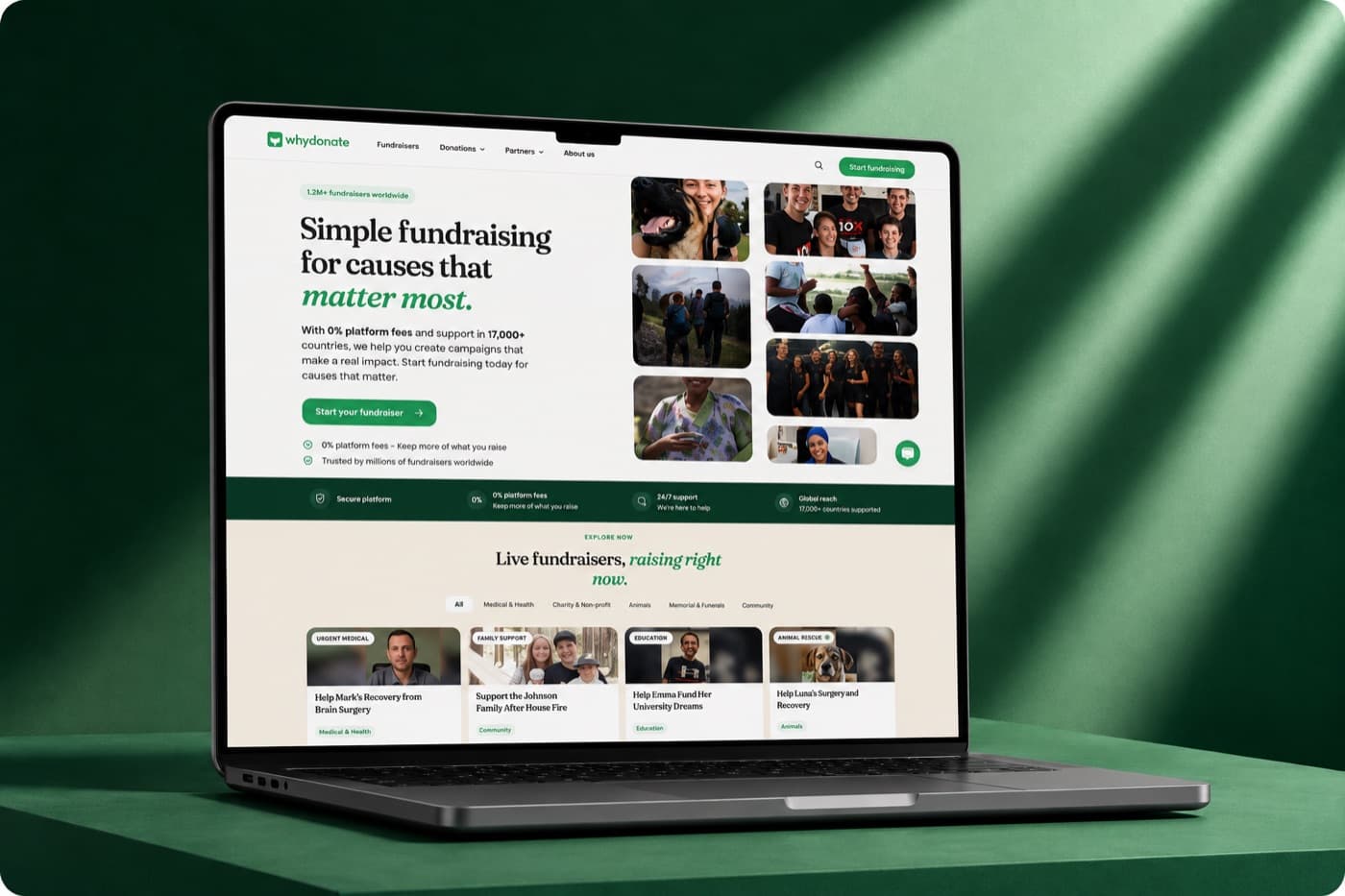
WhyDonate began with a strong concept and a clear intention: make giving simple, and take nothing from the donation. What had not kept pace was the visual language — no agreed type scale, no colour logic, no component library — so each screen and each market was resolved individually. The product's intention was clearer than its expression, and it became harder to extend with every addition.
The work began there: giving a clear idea a form consistent enough to carry it into new products, new languages and new markets. We set the sequence for a long engagement — establish the visual language first, build the system that holds it, then use that foundation to improve the experience — with the system built to hold the European language set in full before any global expansion was considered.
Results
- 7+
- years of ongoing partnership
- 19
- interface languages supported
- 115
- countries reached
- 1M+
- website visitors per month
“They cut our time-to-launch to seconds without losing an ounce of trust.”
A visual language that travels
The identity was developed to work consistently across nineteen languages without redrawing. The symbol and wordmark separate cleanly, so the symbol carries the brand at small sizes — in the app icon, and within the donate button embedded on third-party websites.
The colour system is intentionally restricted. A single green marks the donation action; deep forest supports the trust surfaces — fees, safeguarding, data residency; a neutral base lets fundraiser photography lead. Associations were reviewed across markets before rollout.
Typography with a role per feature
A single type scale, with a typographic role assigned to each feature: campaign pages read long and quiet so the fundraiser's words lead; the donation sheet sets the amount larger than everything around it; dashboards run the densest setting in the system.
Typeface selection prioritised matched-weight coverage across Latin, Greek and Cyrillic, and true tabular figures — amounts, fee breakdowns and payout tables are read in columns, and figures that change width undermine confidence in a financial product.
A system published as living specifications
Each component ships with usage guidance, accessibility notes, localisation behaviour and the reasoning behind the decision, so engineering implements directly rather than interprets from a mockup. Design tokens are delivered as code, from a single source.
Design review is carried out per locale rather than per screen — wrapping, truncation and misplaced currency symbols are rarely visible to a team that does not read the affected language, so the language set is reviewed as a whole, longest strings first.
An experience that feels human
Donating is an emotional act carried out through a financial interface. The donation flow was rebuilt as a single continuous sequence, and fundraiser pages restructured to lead with the person and the story rather than the mechanics.
The organiser journey was mapped end to end — create, share, payout — and rewritten so each stage explains what happens next. Fee breakdowns, verification and payout timing are visible parts of the journey, because transparency is the platform's central promise.
Scale: one codebase, every market
Nineteen interface languages, twenty-seven donation currencies and eighteen payout currencies resolve from a single codebase, with components already tested against the string lengths and scripts each market requires.
Payments were consolidated onto Stripe — one integration, one checkout pattern, with the local method presented first by country: iDEAL in the Netherlands, BLIK in Poland, Swish in Sweden, MB Way in Portugal, among 24 methods.
An ecosystem beyond the campaign page
Plugins and connectors for WordPress, Wix and Zapier were built alongside an embeddable donate button, QR codes and payment requests for collecting in person — components that stay recognisably WhyDonate on host sites we could not see in advance.
Fundraisers were opened up to personalisation: organisers adjust imagery, colour and layout, organisations apply their own branding on custom domains — while the components hold their structure, accessibility and localisation rules regardless of configuration.
Our role on the project
Strategy & Business
- Market-entry sequencing
- Localisation strategy
- Content architecture
- Transparency & trust surfaces
Design
- Brand identity
- Colour & typography systems
- Design system and governance
- Experience redesign
- Design QA per locale
Technology
- Design tokens as code
- Payments consolidation (Stripe, 24 methods)
- WordPress, Wix & Zapier connectors
- Embeddable donate button & QR
- Accessibility (WCAG compliance)